
Minimal photos can be surprisingly powerful in business marketing. When you’re trying to make your business stand out online, it can be tempting to add more—more colour, more text, more graphics, and more things happening in the image.
But more isn’t always more effective.
Sometimes, the image that gets the most attention is the one that gives your audience the least to process.
Light-filled, minimal photography creates space. It gives your website copy room to breathe, makes your branding easier to see, and allows your audience to focus on the thing that actually matters: your business.
And when the goal of your website or marketing is to get someone to read, click, shop, book, or contact you, that clarity matters.
What makes a photo feel “minimal”?
Minimal photography doesn’t necessarily mean an empty room, a white background, or a photograph with almost nothing in it.
It’s more about intentionality.
A minimal photograph might show:
- A business owner working at their desk
- Hands typing on a laptop
- A product surrounded by soft natural light
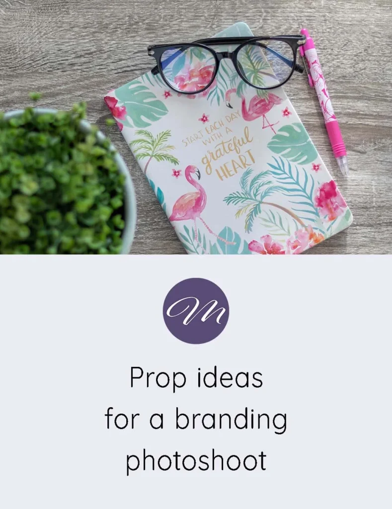
- A notebook and coffee on a clean workspace
- Someone talking with a client
- A detail from your everyday work
- A person walking into their studio or office
- A simple collection of objects related to your business
The difference is that the image isn’t trying to communicate twenty things at once.
There is a clear subject. There is breathing room. There is usually a sense of light and simplicity.
That makes the photograph much easier to use alongside your other marketing.
Busy doesn’t necessarily mean interesting
There’s an important difference between interesting and busy.
An interesting photograph might have beautiful light, genuine emotion, texture, movement, or a strong subject.
A busy photograph might have so many competing details that your eye doesn’t know where to go first.
This becomes particularly noticeable when you add text.
Imagine a social media graphic with a detailed background, several objects, multiple colours, a headline, a subheading, a logo and a call-to-action button.
Every individual element might be perfectly fine.
Together, though, they can become visually exhausting.
Your audience has to work harder to figure out what you’re trying to say.
A simpler photograph can do something very different. It can catch the eye without demanding all of the attention.
That leaves room for your headline to be read.
Your photograph doesn’t have to do all the talking
One of the biggest advantages of minimal photography is that it doesn’t need to communicate your entire message by itself.
Think about a website hero section.
You might have:
A headline explaining what you do.
A short paragraph explaining who you help.
A button telling someone what to do next.
And a photograph creating the visual feeling of the brand.
The photograph doesn’t need to contain text.
It doesn’t need a giant logo.
It doesn’t need a collection of decorative elements.
It simply needs to support the message.
That’s much easier when the photograph has some negative space and a relatively simple composition.
Negative space is useful, not wasted space
Negative space is one of the most useful qualities to look for when choosing business photography.
It’s the area around your main subject that isn’t filled with important visual information.
And that space gives you options.
You can put a headline over it.
You can crop the photograph differently.
You can place a button beside it.
You can use it as the background for a social graphic.
You can leave it completely empty and let the photograph stand on its own.
This is particularly valuable for small businesses because you’re often trying to make the same collection of images work across multiple platforms.
A photograph that looks beautiful but fills every inch of the frame may only work in one particular layout.
A photograph with breathing room can be adapted again and again.
Good photography can make your branding feel more cohesive
Your photographs are part of your visual identity whether you’ve consciously planned them that way or not.
If your website has bright, airy photographs but your social media is filled with dark, heavily edited graphics, your brand can start to feel inconsistent.
The same thing happens when every image has a different colour palette, lighting style or visual mood.
Your audience may not consciously identify the problem, but the overall brand can feel less polished.
If you’re still figuring out the visual side of your business, you may also want to read How to Build a Visual Identity When You’re Not a Designer.
You don’t need to become a graphic designer to create a recognizable visual identity. You just need to start making consistent choices about things like colour, typography, photography and overall mood.
Photography can become one of those consistent elements.
Light-filled images are incredibly versatile
There’s a reason bright, natural-looking photography works so well across different types of businesses.
It tends to leave room for everything else.
A light photograph can sit behind dark text.
It can work alongside a colourful brand.
It can be cropped into a Pinterest pin.
It can become an Instagram post.
It can be used in an email.
It can sit quietly on a service page.
It can become a blog header without overpowering the headline.
And because the image isn’t overly specific, you have more opportunities to reuse it.
That’s important when you’re a small business owner who doesn’t have an unlimited photography budget—or unlimited time to create new content.
Think beyond social media
When people talk about business photography, they often immediately think about Instagram.
But your images have a much longer life than that.
A good collection of photographs can be used across your entire marketing ecosystem.
Think about your:
- Homepage
- About page
- Service pages
- Blog posts
- Email newsletters
- Presentations
- Lead magnets
- PDFs
- Online courses
- Sales pages
- Promotional graphics
This is why I think about stock photography as a library of images, rather than something you download once and use once.
The right photographs can keep working for your business long after you originally downloaded them.
That’s also why choosing images that are flexible and easy to design around can be so valuable.
Your images should feel like your brand—not decoration
There’s another reason to be thoughtful about photography.
People don’t only buy products and services because of what they do.
They also respond to how a business makes them feel.
Photography can help communicate that feeling.
A warm, naturally lit photograph might make a business feel approachable.
A clean workspace might communicate organization.
A photograph of a person interacting with a client might communicate trust.
A close-up of someone creating something might communicate care and craftsmanship.
These are subtle messages, but they’re part of how people experience a brand.
I wrote more about this idea in From Photos to Philosophy: Building a Brand That Feels Human.
Your photography doesn’t need to literally explain your brand values. It can communicate them visually.
Why this matters for conversion
A photograph doesn’t magically make someone buy something.
Conversion is influenced by many things: your offer, your copy, your pricing, your credibility, your website experience, and the audience you’re reaching.
But photography can either support those things or compete with them.
When your visual content is cluttered, people have to spend more effort processing it.
When your photography is simple and intentional, your other content has more room to do its job.
The photograph gets attention.
The headline communicates the message.
The copy provides information.
The call to action tells the visitor what to do next.
Each element has a role.
That’s much more effective than asking one giant graphic to do everything.
You don’t need hundreds of images
Another misconception is that having a strong visual presence means constantly needing new photographs.
You don’t.
You need useful photographs.
A smaller collection of versatile images can be more valuable than hundreds of photographs that are difficult to incorporate into your branding.
Look for images that give you options.
Can you crop them?
Can you add text?
Can they work horizontally and vertically?
Do they fit your brand colours?
Could you use them on your website as well as social media?
Could you see yourself using them six months from now?
If the answer is yes, you’ve found an image that can actually earn its place in your content library.
Choose photographs that leave you room to create
When you’re choosing stock photography, it’s easy to focus entirely on whether you like the photograph.
And obviously, you should like it.
But there’s another question worth asking:
What can I do with this image?
A beautiful photograph that’s impossible to crop or place text over may have limited usefulness.
A simple photograph with beautiful light and plenty of breathing room might become the image you use ten different ways.
That’s one of the reasons I specifically love images that feel natural, light-filled, and uncomplicated.
They don’t dictate your entire design.
They give you somewhere to start.
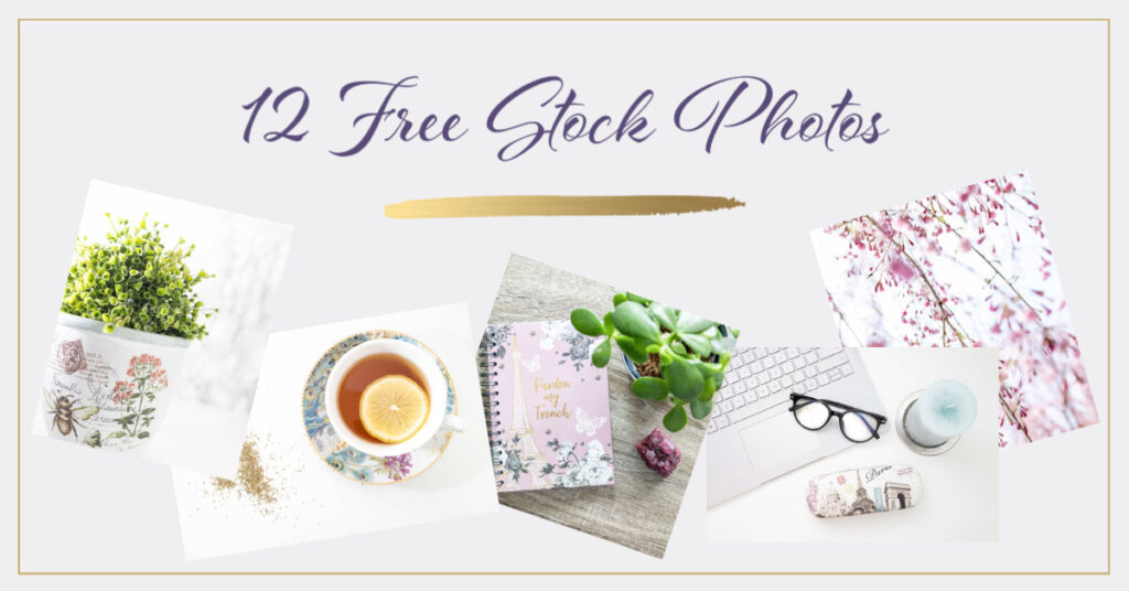
If you’re looking for this kind of imagery for your own business, take a look at The Stock Photos Your Brand Has Been Waiting For.
Try replacing one busy graphic
You don’t have to completely redesign your marketing strategy.
Start small.
Choose one social media graphic that feels particularly crowded.
Remove the background graphics.
Remove anything that isn’t necessary.
Choose a simple photograph with some negative space.
Add your headline.
Add your logo if you need it.
Then stop.
Look at the result.
Does the message feel easier to find?
Does the photograph make you want to look closer?
Does the overall design feel more like your brand?
Sometimes the difference is surprisingly noticeable.
Minimal doesn’t mean impersonal
This is perhaps the most important point.
Minimal photography doesn’t have to make your business feel cold, generic, or corporate.
In fact, the opposite can happen.
Natural light, real people, genuine interactions and small everyday details can make a business feel incredibly human.
The goal isn’t to remove personality.
The goal is to remove unnecessary visual noise so that the personality that’s already there can come through.
Your business doesn’t need to shout to be noticed.
Sometimes it just needs a photograph that gives people a reason to pause.
Give your marketing room to breathe
The next time you’re creating a website page, blog post, or social media graphic, resist the urge to fill every available space.
Start with the photograph.
Look for good light.
Look for a clear subject.
Look for breathing room.
Then build the rest of the design around it.
Your words, branding, and call to action don’t have to fight for attention.
They can work together.
And that’s where minimal photography becomes more than just an aesthetic choice. It becomes a practical tool for creating marketing that feels clearer, more cohesive, and easier for people to engage with.
Looking for light-filled, versatile images for your business?
I’ve created a collection of stock photographs designed to give small businesses beautiful, flexible imagery they can use across their websites, blogs, social media, and marketing materials.