
You don’t need to be a graphic designer to build a strong visual identity for your business.
You don’t need to know how to use Photoshop. You don’t need to understand every design principle. And you certainly don’t need to spend thousands of dollars creating a complicated brand system before you’ve even figured out what you want your business to look and feel like.
What you do need is clarity and consistency.
Your visual identity is the collection of visual elements that help people recognize your business and understand what it represents. It includes things like your colours, fonts, photography, graphics, logo, and overall visual style.
When these elements work together, your business can look polished and recognizable—even if you’re creating most of the visuals yourself.
The good news is that you can build a visual identity gradually.
You don’t have to get everything perfect on day one.
You just need to make a few intentional decisions and then use them consistently.
What Is a Visual Identity?
Before choosing colours or fonts, it helps to understand what you’re actually creating.
Your visual identity is the visual expression of your brand.
It can include:
- Your logo
- Brand colours
- Fonts and typography
- Photography
- Illustrations
- Icons and graphics
- Patterns and textures
- Website imagery
- Social media graphics
- The overall look and feel of your content
Your visual identity isn’t necessarily the same thing as your logo.
In fact, your logo is only one small part of the picture.
Think about brands you recognize without seeing their names. You might recognize a particular colour combination, style of photography, typography, packaging, or visual treatment.
That’s the power of a cohesive visual identity.
Your goal isn’t necessarily to make every piece of content look identical.
Your goal is to make your content feel like it belongs to the same brand.
Start With How You Want Your Brand to Feel
This is where I recommend starting before opening Canva or choosing a colour palette.
Ask yourself:
How do I want people to feel when they encounter my business?
Do you want your brand to feel:
- Calm?
- Energetic?
- Sophisticated?
- Warm?
- Playful?
- Modern?
- Minimal?
- Creative?
- Approachable?
- Luxurious?
- Grounded?
- Bold?
Choose three to five words that describe the feeling you want your brand to communicate.
Don’t worry about finding the “right” words.
They are simply a filter for the decisions you’re going to make later.
For example, imagine you run a wellness business and choose:
Calm · Warm · Natural · Sophisticated
Those words can guide your choices.
You might lean toward softer colours, natural textures, clean typography, and relaxed photography.
Someone with a brand described as:
Bold · Energetic · Playful · Modern
might make completely different visual choices.
Neither is better.
They’re simply communicating different things.
Create a Simple Brand Moodboard
Once you know how you want your brand to feel, start collecting visual inspiration.
This is one of the easiest ways to develop a visual identity when you’re not a designer.
Create a folder or digital moodboard and collect images that represent the direction you want to take.
You might include:
- Interior spaces
- Fashion
- Photography
- Packaging
- Typography
- Colour combinations
- Nature
- Architecture
- Textures
- Artwork
- Websites
- Editorial layouts
Don’t worry about whether each image relates directly to your business.
You’re looking for a visual feeling.
After you’ve collected 15–30 images, step back and look for patterns.
Do you keep choosing similar colours?
Are the images bright or dark?
Clean or textured?
Minimal or layered?
Warm or cool?
Polished or relaxed?
These patterns can tell you a lot about your natural visual preferences.
And they give you something much more useful than randomly choosing a colour palette from a template.
Choose a Small Colour Palette
You don’t need twelve brand colours.
In fact, having too many colours can make your brand harder to keep consistent.
A simple starting point is:
One primary colour
This is your main recognizable brand colour.
One or two supporting colours
These complement your primary colour and give you some flexibility.
One or two neutral colours
These can be used for backgrounds, text, and other areas where you need something understated.
For example:
- Deep green
- Soft sage
- Warm cream
- Charcoal
That’s already enough to create a cohesive visual system.
Your colours don’t have to appear in exactly the same proportions everywhere.
Instead, think of them as a toolkit.
Your website might use mostly neutrals with small accents of your primary colour.
Your social media graphics might use more of your primary colour.
Your photography might contain the colours naturally through locations, clothing, props, and environments.
Consistency doesn’t mean repetition.
It means recognition.
Also read: 3 Tips for Colour Branding in Photography.
Choose Fonts You Can Actually Use
Typography can feel intimidating if you’re not a designer, but you don’t need to become an expert in fonts.
Start with two.
A heading font and a body font are usually enough.
Your heading font can have more personality.
Your body font should be easy to read.
For example, you might pair:
Elegant serif + clean sans serif
or
Modern sans serif + understated serif
The important thing is that they complement each other.
Avoid choosing several decorative fonts simply because you like them individually.
A visual identity becomes much easier to maintain when you have a small number of clear rules.
For example:
Headings: Font A
Body: Font B
Buttons: Font A
Captions: Font B
Now you don’t have to make a new typography decision every time you create something.
Your Photography Is Part of Your Visual Identity
This is an area that’s often overlooked.
Your photography isn’t simply decoration.
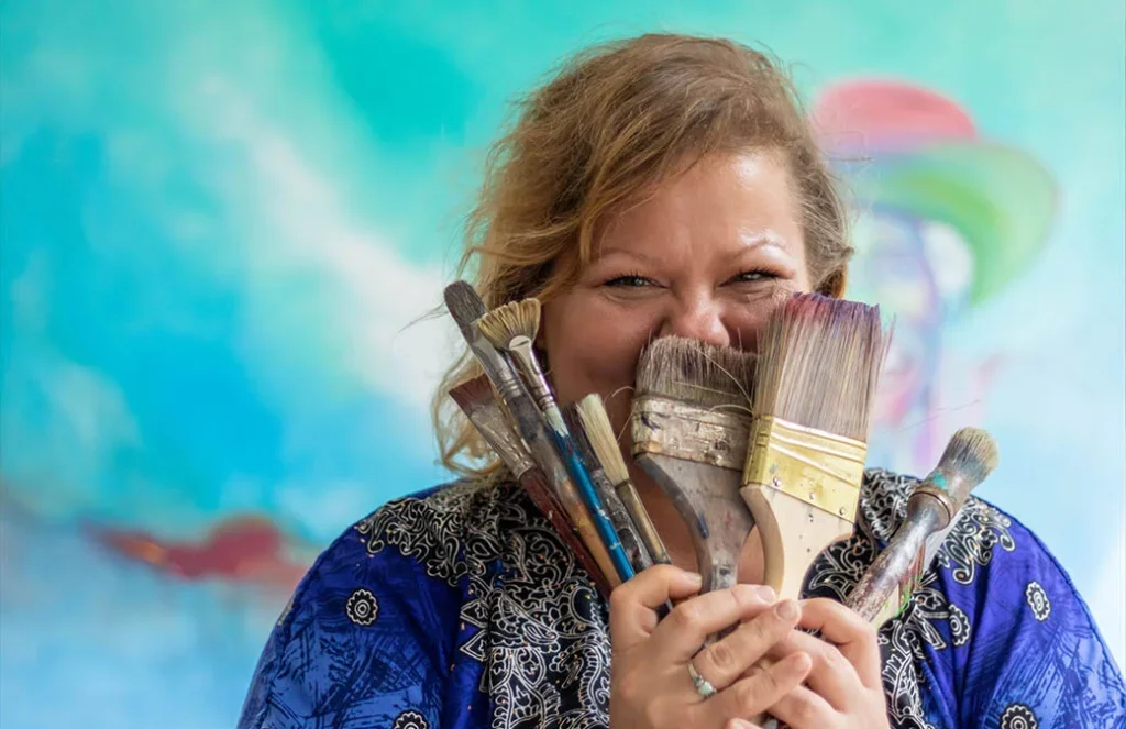
For many businesses, photography is one of the most powerful parts of their visual identity.
Think about the difference between a website filled with random stock photos and one where every image has a consistent feeling. See The Most Useful Types of Branding Photos for more insight.
The second immediately feels more intentional.
Consider:
- Lighting
- Colour
- Composition
- Backgrounds
- Locations
- Clothing
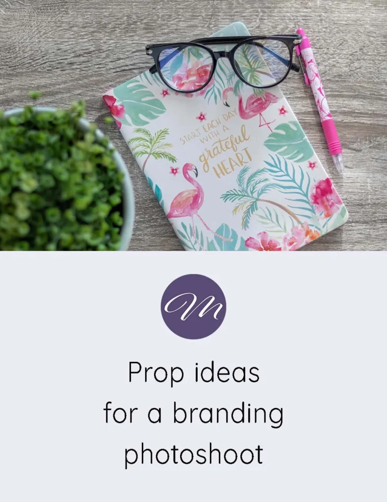
- Props
- Editing style
- Subject matter
If your brand is warm and approachable, extremely dark and dramatic imagery may feel disconnected.
If your brand is sophisticated and editorial, bright generic stock photography might not communicate the right message.
Your photography should support the same feeling you’ve established with your colours and typography.
And this doesn’t mean every image has to look identical.
You simply want the images to feel like they’re coming from the same visual world. This post expands on this topic even more: From Photos to Philosophy: Building a Brand That Feels Human.
Decide What Your Brand Should Look Like Online
Now bring all of these decisions together.
Imagine someone visits your:
- Website
- Instagram profile
- LinkedIn page
- Pinterest account
- Email newsletter
- Sales page
Would they recognize that these all belong to the same business?
They don’t need to be identical.
But there should be visual connections.
Maybe the same colours appear throughout.
Maybe you use the same typography.
Maybe your photography has a consistent style.
Maybe your graphics have similar spacing and composition.
Maybe your overall approach is clean and minimal.
These small details create familiarity.
And familiarity builds trust.
For a deeper dive on this, read What Most Creatives Get Wrong About Branding — and How to Fix It.
Create a Simple Brand Style Guide
This is where everything becomes much easier.
You don’t need a 50-page brand manual.
Create a simple document containing:
Brand personality
Write down three to five words describing how your brand should feel.
Colours
List your primary, secondary, and neutral colours.
Include the colour codes if possible so you can reproduce them accurately.
Fonts
Write down your heading and body fonts.
Photography
Describe the type of imagery you want to use.
For example:
Bright, natural, warm, candid, lifestyle-focused photography with soft colours and plenty of natural light.
Graphic style
Write down any preferences around:
- Shapes
- Borders
- Textures
- Icons
- Patterns
- Layout
Examples
Include a few images that demonstrate the direction.
This document becomes your visual reference point.
Instead of asking:
“Does this look good?”
you can ask:
“Does this look like my brand?”
That’s a much better question.
Don’t Try to Copy Another Brand
One of the easiest traps when creating a visual identity is finding a brand you love and trying to recreate it.
It’s completely fine to use other businesses for inspiration.
But your goal isn’t to become a copy of something you admire.
Pay attention to what you like about their visual identity.
Maybe you love the simplicity.
Maybe you like their photography.
Maybe you like the colour palette.
Maybe you love how much white space they use.
Figure out the underlying qualities rather than copying the surface.
Your visual identity should eventually become a reflection of your own business.
Consistency Matters More Than Perfection
This might be the most important part.
Your visual identity doesn’t have to be perfect.
It needs to be recognizable.
If you change your colours every month, use five different fonts, constantly switch photography styles, and redesign your social media graphics every time you see a new trend, your audience has nothing consistent to associate with you.
Give your visual identity time to become familiar.
You can refine it.
You can evolve it.
You can make changes as your business grows.
But you don’t need to completely reinvent it every few weeks.
Your Brand Can Evolve
There’s also a difference between consistency and being stuck.
Your visual identity should be allowed to evolve as your business evolves.
Maybe your original colours no longer feel right.
Maybe your photography has become more sophisticated.
Maybe you’ve moved from a playful brand into a more professional one.
Maybe your audience has changed.
That’s okay.
A visual identity isn’t a permanent decision.
Think of it as a framework.
The framework gives you consistency while still leaving room for growth.
You Don’t Need to Do It All at Once
If you’re starting from scratch, don’t try to solve everything in one afternoon.
Start with these five decisions:
1. How do I want my brand to feel?
Choose three to five words.
2. What colours represent that feeling?
Create a simple palette.
3. Which two fonts will I use?
Choose one for headings and one for body text.
4. What should my photography look and feel like?
Define the lighting, mood, and style.
5. What visual elements will I repeat?
Choose a few details that make your brand recognizable.
That’s enough to begin.
You can build the rest over time.
A Visual Identity Makes Content Creation Easier
There’s another benefit to having a visual identity that doesn’t get enough attention:
It reduces decision fatigue.
Without a visual system, every new piece of content requires dozens of decisions.
Which colour?
Which font?
Which image?
Which layout?
Which style?
Which graphic?
Once you’ve established some guidelines, those decisions become much easier.
You already know what belongs to your brand.
That means you can spend more time thinking about the message instead of reinventing the visual presentation every time.
Your brand becomes a framework that supports your creativity rather than restricting it.
Your Visual Identity Doesn’t Have to Be Complicated
A strong visual identity isn’t necessarily the most elaborate one.
Sometimes the most memorable brands are built around a very simple combination of:
- A recognizable colour palette
- Two complementary fonts
- Consistent photography
- A clear tone
- A handful of repeatable design elements
That’s it.
The goal isn’t to impress other designers.
The goal is to help your audience recognize you, understand what you offer, and develop confidence in your business.
Your visual identity is there to support your message—not compete with it.
Final Thoughts
Building a visual identity when you’re not a designer is completely possible.
You don’t need to know every rule of graphic design.
You need to understand your business, your audience, and the feeling you want your brand to communicate.
Start with your brand personality.
Create a moodboard.
Choose a simple colour palette.
Select two fonts.
Define your photography style.
Create a basic brand style guide.
Then use those decisions consistently across your website, content, social media, email marketing, and other customer touchpoints.
Most importantly, give yourself permission to start simple.
Your visual identity can grow alongside your business.
You don’t have to have everything figured out before you begin.
Create Your Own Brand Style Guide
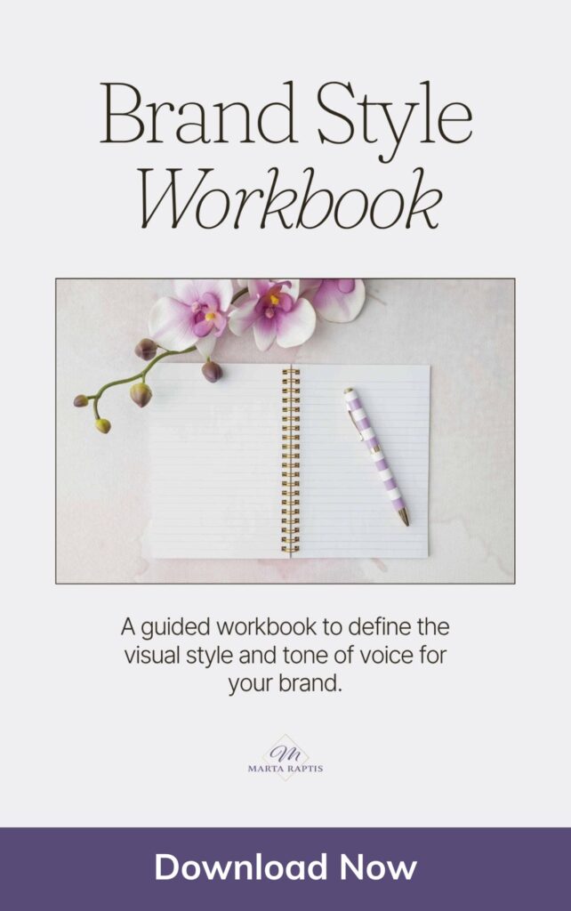
If you’re ready to start putting these ideas together, I’ve created a free Brand Style Workbook to help you define the visual direction for your business.
It’s designed to give you a practical place to work through your brand colours, typography, imagery, and overall visual style so you can create a more cohesive brand—even if you’re not a designer.