

Aside from doing personal brand photography, I also enjoy exploring many other genres. Photography has always been more than a job for me — it’s a way of observing the world, slowing down, and noticing things I might otherwise rush past. One of my favourite things to do is simply wander outside with my camera and let curiosity lead the way. There’s something grounding about walking with no agenda, noticing small details, and capturing whatever catches my eye. Give me a quiet street, a bit of sunlight, and a camera in my hand, and I’m in heaven. This is how I discovered the many colours of Mississauga.
During the Covid years, when life slowed down and our worlds became much smaller, these little personal photography projects became my escape. They were a cure for boredom, yes — but also a way to stay creative when everything else felt uncertain. They reminded me that inspiration doesn’t always require travel or grand scenery. Sometimes it’s hiding in the familiar places we pass every day, waiting for us to pay attention. Those long walks became a ritual, a way to reconnect with myself and with the city I call home.
Mississauga isn’t a city that people typically associate with colour. It’s not Paris with its pastel shutters, or Lisbon with its tiled facades, or Burano with its rainbow houses. Mississauga is quieter, more understated, more subtle. Its palette reveals itself slowly — in small pockets, in unexpected corners, in the way light hits a surface at just the right moment. But that subtlety became the challenge, and the challenge became the fun. Searching for colour here felt like a treasure hunt, one that required patience, curiosity, and a willingness to see the ordinary in a new way.
The Book That Sparked the Idea
Around that time, I added a few new photography books to my collection. One of them, Paris in Color by Nichole Robertson, sparked something in me. The book is filled with charming images grouped by colour — simple, playful, and beautifully cohesive. It made me think about how colour shapes our experience of a place, and how often we overlook it.
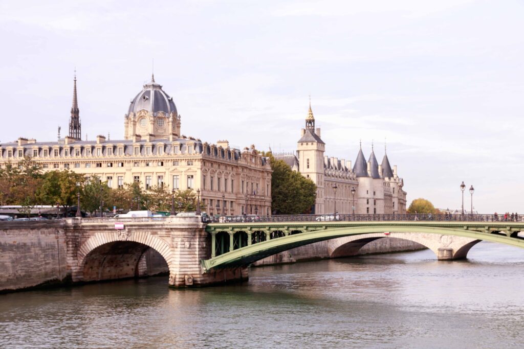
When I visited Paris years ago, I didn’t pay attention to colour in this way. I was too busy absorbing everything else — the architecture, the atmosphere, the rhythm of the city. But after flipping through that book, I wondered: What would happen if I tried this in my own city? What colours would I find here, in Mississauga?
The idea felt both silly and exciting. Silly because Mississauga isn’t exactly known for its vibrant palette. Exciting because maybe that was the point — maybe the colours were there, just waiting to be noticed.
Nevertheless, I still took plenty of photos while in Paris (without specifically paying attention to colour), and you can view my own Paris Photography collection here.
The Challenge of Photographing the Colours of Mississauga
Mississauga, as it turns out, is a little more subtle. It doesn’t burst with colour the way European cities do. Its palette is quieter, more understated, and sometimes harder to spot. I quickly realized that creating a full “colours of Mississauga” book would require a lot more time — and probably a lot more walking.
But that was the beauty of it. This wasn’t about capturing postcard‑perfect scenes. It was about slowing down, paying attention, and letting the city reveal itself one shade at a time.
Below are some of the results from my photo excursions — a small, imperfect, but heartfelt attempt to capture the colours of Mississauga.
THE COLOURS OF MISSISSAUGA
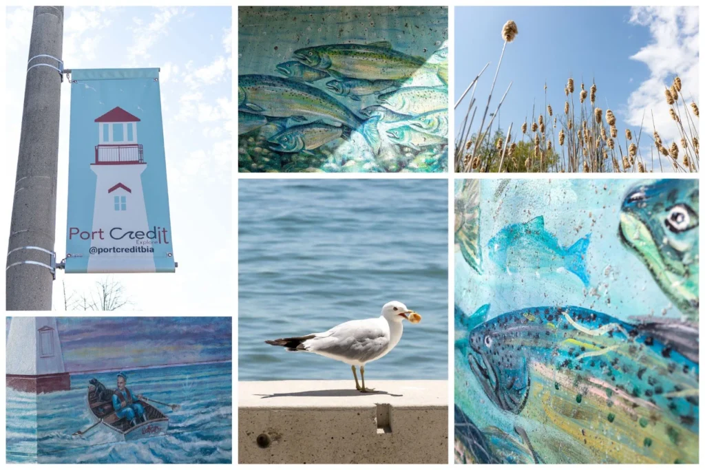
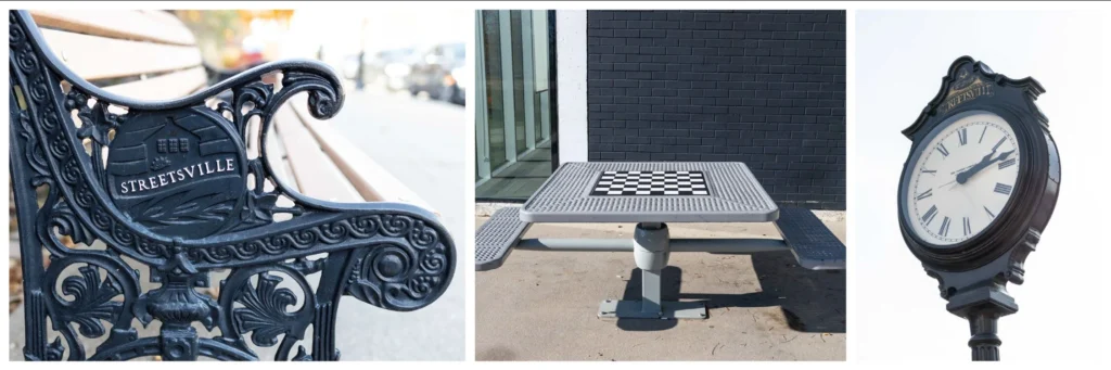
Blue: The Colour of Port Credit
Blue was one of the easiest colours to spot, especially around Port Credit. The water, the boats, the sky — everything seems to lean into shades of blue in that neighbourhood. It’s calming, expansive, and always photogenic. Blue is the colour that makes Mississauga feel open and airy, especially along the waterfront.
Blue here isn’t just a colour; it’s a feeling. It’s the breeze off the lake, the sound of waves hitting the rocks, the quiet moments when the city feels far away. It’s the colour that makes you breathe a little deeper.
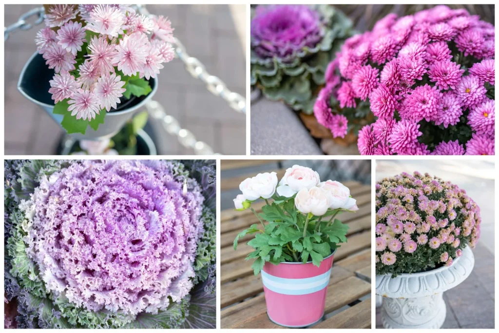
Pink: Fleeting and Delicate
Pink was much harder. Mississauga isn’t exactly overflowing with pastel storefronts or rosy façades. Most of the pink I found came from floral arrangements scattered across the city — small bursts of colour tucked into gardens and planters.
Pink here feels delicate, almost shy, appearing only in brief moments before disappearing again. It’s the colour of spring blossoms, of soft petals, of tiny details you’d miss if you walked too fast.
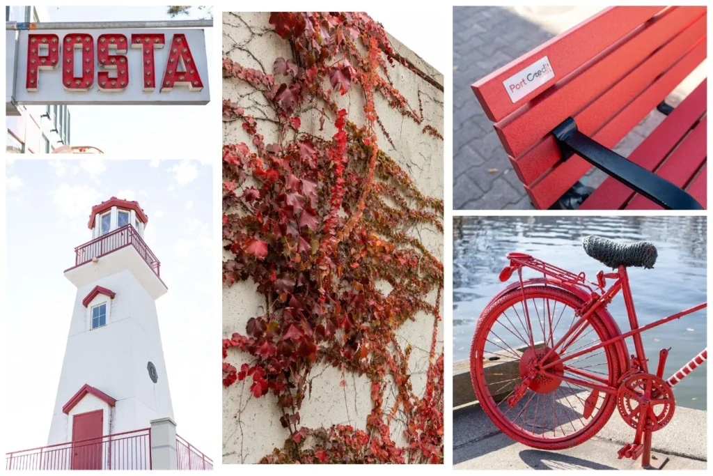
Red: Bold and Confident
Red wasn’t too difficult either, though again, Port Credit offered the most variety. From signage to brickwork to little architectural accents, red showed up in bold, confident pops. It’s a colour that demands attention, even in a city that tends to lean toward neutrals.
Red in Mississauga feels energetic — the colour of movement, of life, of small but striking details that break up the monotony of grey and beige.
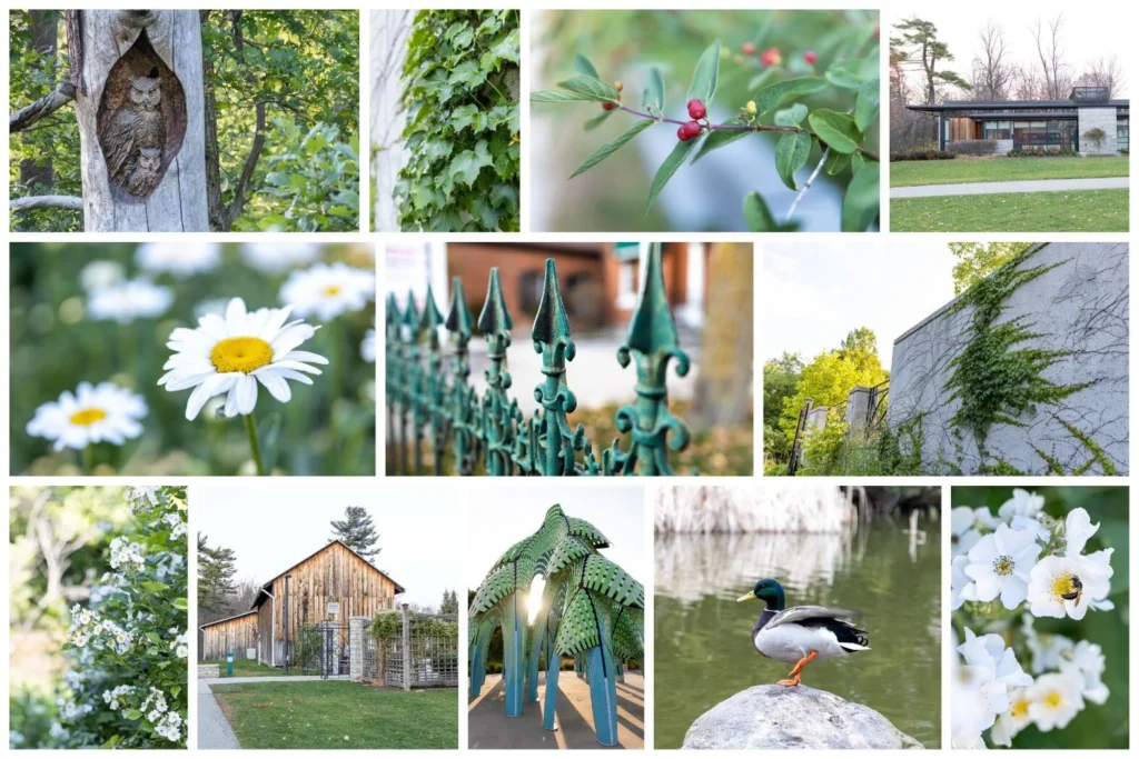
Green: Everywhere and Almost Too Easy
Green almost felt like cheating. There’s so much of it everywhere — trees, parks, trails, and nature in every direction. It’s the colour that defines Mississauga in many ways, but because it’s so abundant, I kept wondering if it even counted.
But the more I photographed it, the more I realized that green is the backbone of this city. It’s the colour that softens the concrete, that fills the spaces between buildings, that makes Mississauga feel livable and grounded.
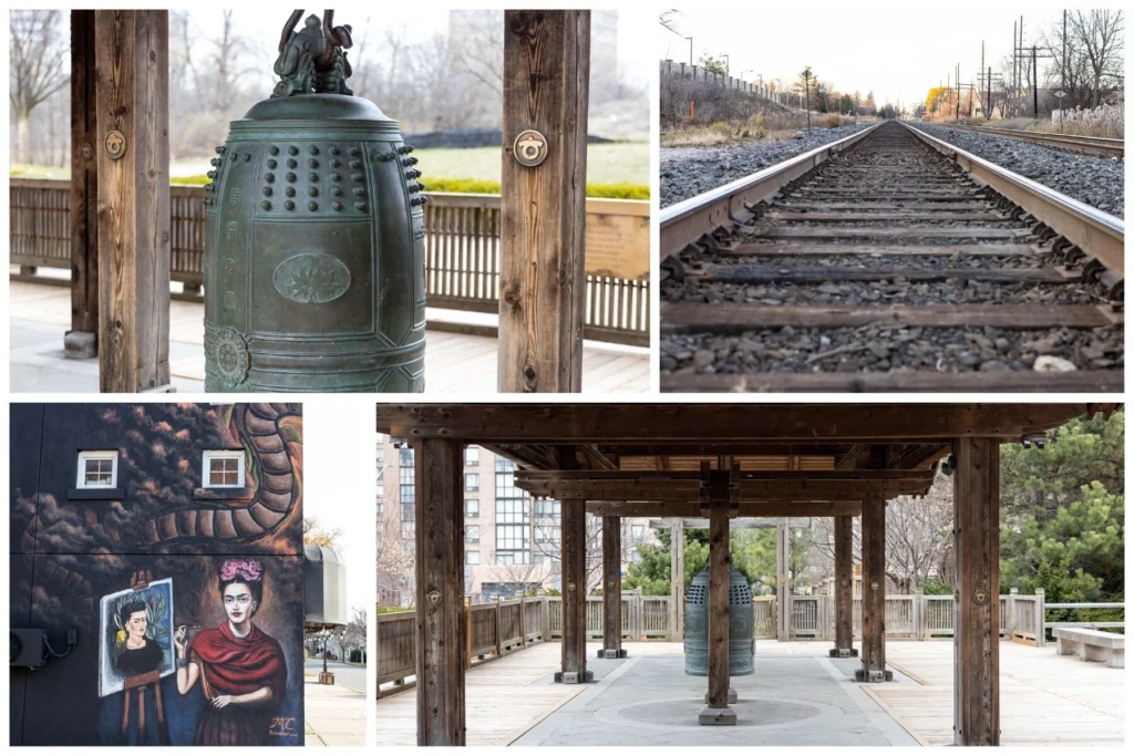
Black: Shadows, Textures, and Contrast
Black appeared in small, graphic moments — shadows, textures, architectural details. It’s not a colour we usually think of photographing, but it adds contrast and mood in a way that surprised me.
Black gives structure to the city. It outlines shapes, defines edges, and adds a sense of depth. It’s the colour that makes everything else stand out.
Brown: Earthy and Everywhere
Brown is probably the easiest colour to find, but definitely not my favourite. It’s earthy and grounding, but also a bit drab. Still, it’s part of the city’s visual language — the brick buildings, the tree trunks, the soil, the wooden fences. Brown is the quiet backdrop behind everything else.
Photographing brown made me appreciate the textures of the city — the roughness, the warmth, the natural elements that often go unnoticed.
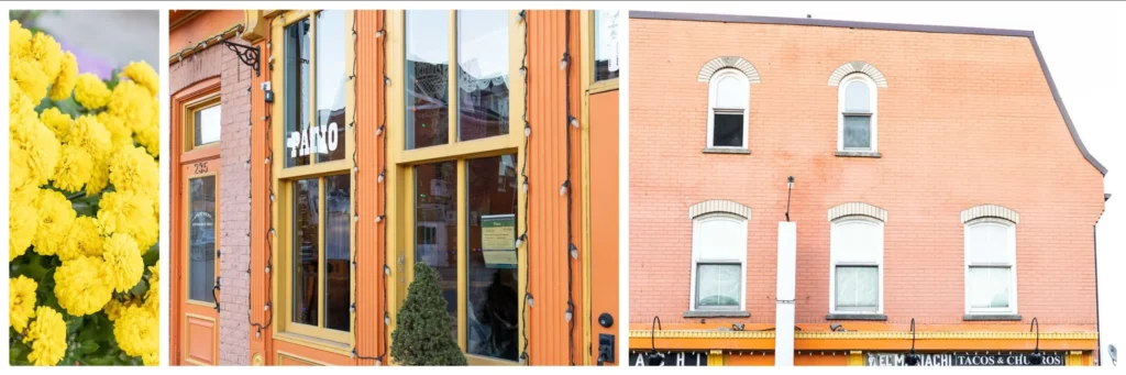
Yellow & Orange: Rare Treasures
These two were the rarest of all. I found only one yellow floral arrangement and one orange building — not nearly enough for separate sections, so I combined them. Mississauga may not be bursting with warm tones, but when they do appear, they feel cheerful and unexpected, like little surprises waiting to be found.
Yellow and orange are the colours that make you smile. They’re bright, optimistic, and full of personality — even if they’re hard to find.
WHAT THIS PROJECT TAUGHT ME
Seeing Mississauga With New Eyes
This project reminded me that creativity doesn’t always require a plane ticket or a dramatic landscape. Sometimes it’s as simple as stepping outside your front door with fresh eyes. The colours of Mississauga may be quieter, but they’re there — you just have to look a little harder, walk a little slower, and let yourself notice the small things.
The Beauty of Slow Photography
In a world that moves quickly, this project forced me to slow down. To pay attention. To look for beauty in places I normally overlook. It was a reminder that photography isn’t always about the perfect shot — sometimes it’s about the process, the wandering, the noticing.
A Project I Want to Continue
Now that I’ve written this post, I feel inspired to start this project all over again and search for even more colour. I don’t feel finished with it yet. Maybe I never will be — maybe this will become one of those ongoing creative projects that evolves with time, seasons, and the way I see the world.
SHARE YOUR COLOURFUL SPOTS
If you live in Mississauga and know of any colourful spots I should explore, I’d truly love to hear your suggestions. This city has so many hidden corners, and sometimes the most unexpected places hold the brightest surprises. Maybe it’s a mural tucked behind a café, a row of houses painted in cheerful tones, a garden bursting with seasonal blooms, or even a single storefront that stands out from the rest. Colour shows up in the most unpredictable ways, and half the joy is stumbling upon it when you least expect it.
One of the things I love most about personal projects like this is how they naturally become collaborative. We all see our city differently — through our routines, our neighbourhoods, our commutes, our favourite walking routes. What feels ordinary to one person might feel magical to someone else. And often, the most interesting discoveries come from someone saying, “Have you ever noticed this?” or “You should check out that corner — it’s beautiful at sunset.”
So if you have a favourite spot, a secret corner, or even just a hint of colour you’ve noticed on your daily route, feel free to share it. I’d love to keep exploring, keep documenting, and keep celebrating the subtle, surprising palette of the place we call home. Maybe together we can uncover even more of the hidden colours of Mississauga — one walk, one photo, one tiny detail at a time.
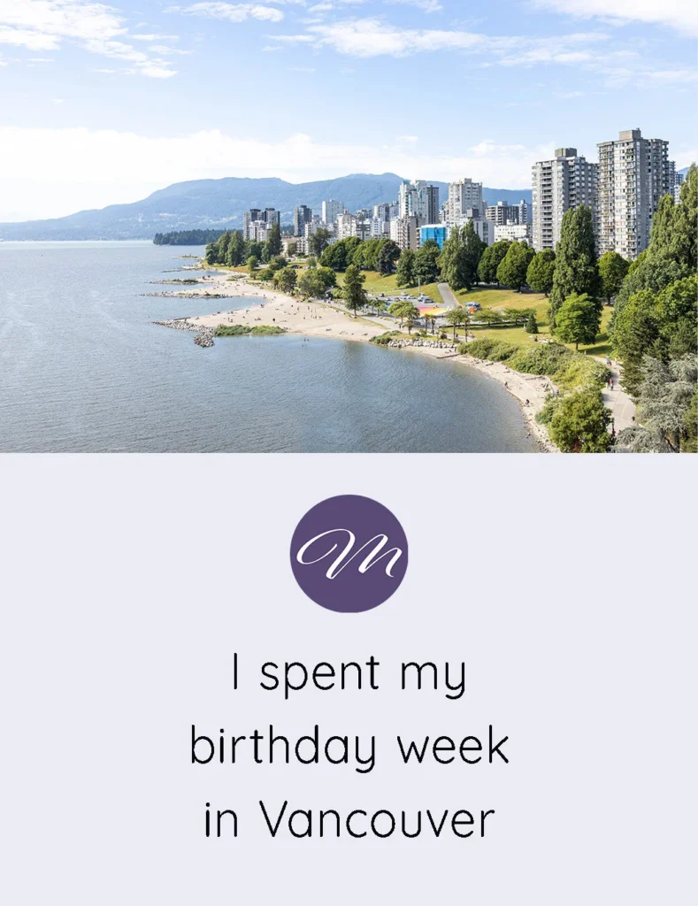
For more of my personal creative photography projects, check out My Week In Vancouver and Greece Travel Photos.

I really enjoyed this color story, Marta. It gave your friend from the other side of the border a taste of life up North. And hey, the green from nature totally counts in my eyes – that’s the original green, after all 🙂 Love what you are creating!
I’m glad you enjoyed it Sophia! Thanks for saying my green counts hehe 🙂
Veryy creative post